How to Optimize Your eCommerce Product Page for Conversions
Are you struggling to convert visitors into customers on your eCommerce site?
The problem might be lying right under your nose: your product page. In today’s fiercely competitive online market, a poorly optimized product page can agitate potential buyers, leading them to bounce off your site.
But don’t worry, there’s a solution! With the growth of eCommerce expected to soar, optimizing your product pages is no longer optional; it’s essential.
By fine-tuning your SEO and focusing on user experience, you can drive conversions and sales, turning those frustrated visitors into satisfied customers.
Let’s dive into how you can make this happen!
What is product page optimization?
Product page optimization refers to the process of making changes to and updating product pages with the goal to increase the probability of conversion.
This revolves around not only aesthetics of the page, but also encompasses descriptive content, SEO practices, customer reviews, pricing, and shipping information.
A well-optimized page aims at delivering high-quality user experience making it easier for potential buyers to make their purchase decision.
It is about attracting customers who are interested in the product, keeping them engaged, and ultimately prompting them to buy the product.
Why Should You Optimize Your Product Page?
“Why bother?” you might ask. Well, let me tell you a story. Imagine two stores selling the same product.
One has a well-organized, attractive display with all the information you need. The other? A mess. Which one would you buy from?
Optimizing your product page is like being that well-organized store. Here’s why it matters:
- Higher Conversion Rates: A well-optimized page guides customers to the checkout. It’s like a path lit with lanterns leading to a treasure.
- Better SEO Ranking: Search engines love pages that provide value. Think of them as quality inspectors, giving thumbs up to the best shops in town.
- Enhanced User Experience: Ever been to a store where everything just feels right? That’s what optimization does to your product page.
- Increased Trust: A professional, well-designed page tells customers, “We care about you.” It builds trust, and trust builds sales.
Ways to Optimize an Ecommerce Product Page
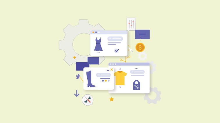
1. Understanding Your Product Page
1.1 Components of a Great eCommerce Product Page
Product Details
Imagine walking into a store and finding a product with no label, no price, no description.
Frustrating, right? The same goes for online shopping. Detailed product information is like a friendly store assistant telling you everything you need to know. It includes:
- Name: What’s it called?
- Price: How much does it cost?
- Description: What does it do? What’s it made of?
- Availability: Is it in stock?
- Shipping Information: How long will it take to arrive?
Related: How to Optimize Product Category Pages on Your Ecommerce Website.
Branding
Your product page isn’t just a place to sell a product; it’s a place to sell your brand.
Your branding is like the decor of a physical store - it sets the mood and tells customers what you’re all about. This includes:
- Logo: Your business’s visual identity.
- Color Scheme: Consistent with your brand’s theme.
- Tone of Voice: Is your brand fun, serious, professional? Your copy should reflect that.
Copywriting
The words you use on your product page can make or break a sale. Good copywriting is like a persuasive salesperson.
It doesn’t just describe the product; it sells the experience of owning the product. Consider:
- Features vs. Benefits: Don’t just list features; explain how they benefit the customer.
- Clear Language: Avoid jargon. Speak your customer’s language.
- Engaging Tone: Be conversational and compelling. Keep your reader’s attention.
Design and User Experience
Navigating an online store should be a breeze, not a maze. The design and user experience of your product page are like the layout of a physical store. It should guide customers effortlessly from the entrance to the checkout. Consider:
- Layout: Is everything where it should be? Can customers find what they’re looking for easily?
- Visual Appeal: Is your page pleasing to the eye? Does it make customers want to stay and explore?
- Responsiveness: Does your page look good on all devices? Remember, many people shop on their phones.
- Loading Speed: Are your pages quick to load? Slow pages can turn customers away.
- Navigation: Are menus, buttons, and links intuitive? Can customers find their way around without getting lost?
Read More: How to Start a Business Online from scratch: 8 Steps to Launch
1.2: The Role of Keywords
Long-Tail Keywords
Long-tail keywords are like the specific aisles in a supermarket. They guide customers to exactly what they’re looking for. Instead of vague terms like “shoes,” you’re targeting specific searches like “men’s waterproof hiking boots size 10.” Consider:
- Specificity: Are you targeting the exact needs and wants of your customers?
- Competition: Long-tail keywords often have less competition. Are you taking advantage of that?
- Conversion: People searching for long-tail keywords are often closer to making a purchase. Are you reaching them at the right moment?
Transactional Intent
Some keywords signal that a customer is ready to buy. These are like the customers in a physical store who head straight to the checkout. They know what they want, and they’re ready to buy it. Consider:
- Buying Keywords: Are you targeting terms like “buy now,” “best price,” or “discount”?
- Customer Readiness: Are you reaching customers at the moment they’re ready to make a purchase?
- Ad Alignment: If you’re running ads, are they aligned with transactional keywords to maximize conversions?
Tools for Keyword Research
Finding the right keywords is like having a map to hidden treasure. It guides you to where your customers are. Consider:
- Research Tools: Are you using tools like Google’s Keyword Planner or SEMrush to find the best keywords?
- Competitor Analysis: Are you looking at what keywords your competitors are ranking for? Can you compete or find a niche they’ve missed?
- Trends: Are you keeping an eye on trending keywords in your industry? Are you agile enough to take advantage of sudden opportunities?
2. On-Page Optimization Strategies

2.1: Titles and Meta Descriptions
Unique Titles
Unique titles are like the headlines of a newspaper. They catch the eye and tell readers what to expect. Each product page should have a unique title that accurately describes the product. Consider:
- Keywords: Are you including relevant keywords in your titles?
- Length: Are your titles concise yet descriptive? Search engines typically display the first 50-60 characters.
- Relevance: Are your titles relevant to the content of the page? Misleading titles can turn customers away.
Including Brand, Product Name, Model Number
Your titles should also include specific details like the brand, product name, and model number. It’s like labeling shelves in a store. Consider:
- Search Queries: Are you matching the terms people might search for?
- Clarity: Are you providing clear information that helps customers know they’re in the right place?
- Consistency: Are you consistent in how you present this information across all your product pages?
2.2: High-Quality Visuals
Importance of Images and Videos
Images and videos are like the window displays of your online store. They attract attention and give customers a visual taste of what you’re offering. Consider:
- Quality: Are your images and videos high quality? Blurry or pixelated visuals can harm your credibility.
- Relevance: Are your visuals relevant to the product? They should accurately represent what you’re selling.
- Variety: Are you providing different views and angles? Customers can’t physically touch the product, so visuals must provide a comprehensive view.
Related: Must-Know Ecommerce Image Optimization Tips for Better Conversions
360º Vision and Multiple Perspectives
Offering 360º views and multiple perspectives is like letting customers pick up a product and look at it from all angles. Consider:
- Interactivity: Are you allowing customers to “rotate” the product and see it from different angles?
- Detail: Are you providing close-ups of specific features or parts of the product?
- Experience: Are you creating an immersive visual experience that helps customers feel like they’re seeing the product in person?
2.3: Detailed Product Information
Clear and Concise Details
Providing clear and concise details is like having a knowledgeable salesperson who can answer any question. Consider:
- Readability: Are your product details easy to read and understand?
- Organization: Are you organizing information in a way that makes sense to the customer?
- Essentials: Are you covering all the essential information that a customer might need to make a decision?
Related: How to Write Winning Product Descriptions That Drive Sales
Personal Touch and Value Communication
Adding a personal touch and communicating value is like having a salesperson who understands the customer’s needs and can explain why a product is perfect for them. Consider:
- Storytelling: Are you telling a story about the product that resonates with the customer?
- Value Proposition: Are you clearly communicating what makes this product valuable or unique?
- Connection: Are you connecting with the customer on an emotional level, making them feel like this product was made for them?
3. Enhancing User Experience

3.1: Call-to-Action (CTA) Optimization
Testing Different CTAs
Your Call-to-Action (CTA) is like a signpost guiding customers to the checkout. But not all signposts are created equal. Testing different CTAs helps you find what works best for your audience. Consider:
- Language: Are you using compelling language that resonates with your customers?
- Placement: Are your CTAs placed where customers can easily see and click them?
- Results: Are you tracking the results of different CTAs to see what’s most effective?
Size, Color, and Animation Considerations
The size, color, and even animation of your CTAs can make a big difference. It’s like choosing the right font and color for a sign. Consider:
- Visibility: Are your CTAs easy to see? Are they big enough without being overwhelming?
- Contrast: Are you using colors that stand out but also fit with your overall design?
- Engagement: Are you using subtle animations to draw attention without being distracting?
3.2: Customer Reviews and Testimonials
Building Trust
Customer reviews and testimonials are like personal recommendations from friends. They build trust and show that others have been happy with their purchase. Consider:
- Authenticity: Are you encouraging real reviews from real customers?
- Visibility: Are you displaying reviews where potential customers can easily see them?
- Response: Are you responding to reviews, both positive and negative, to show that you care?
Encouraging User-Generated Content
User-generated content, like customer photos or videos, adds another layer of authenticity. It’s like having customers show off their purchases to their friends. Consider:
- Incentives: Are you offering incentives for customers to share their experiences?
- Community: Are you building a community where customers can share and connect?
- Integration: Are you integrating user-generated content into your product pages to enhance the shopping experience?
3.3: Mobile Optimization
Importance of Fast-Loading Pages
In today’s fast-paced world, slow-loading pages are like slow-moving checkout lines. They frustrate customers and can lead to lost sales. Consider:
- Speed: Are your pages loading quickly, especially on mobile devices?
- Optimization: Are you using tools to optimize images and scripts for faster loading?
- Monitoring: Are you regularly checking your site’s speed and making necessary adjustments?
Mobile-Friendly Design
With so many people shopping on their phones, a mobile-friendly design is like having a store that’s easy to navigate even in a crowded space. Consider:
- Responsiveness: Is your design adapting to different screen sizes?
- Usability: Are buttons, links, and menus easy to use on a touch screen?
- Consistency: Is the mobile experience consistent with the desktop experience, maintaining your branding and functionality?
Related: 8 Best Mobile friendly website builders.
4.Technical SEO Considerations
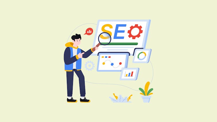
4.1: Structured Data and Rich Snippets
Product Schema and Review Schema
Structured data, like product schema and review schema, is like adding detailed labels to your products. It helps search engines understand your content better. Consider:
- Visibility: Are you using schema to make your products stand out in search results?
- Relevance: Are you using the right types of schema for your products and reviews?
- Accuracy: Are you ensuring that the information in your schema is accurate and up-to-date?
Impact on CTR and Sales
Rich snippets, created from structured data, can significantly impact click-through rates (CTR) and sales. It’s like having an eye-catching sign in a store window. Consider:
- Engagement: Are your rich snippets engaging users and encouraging them to click?
- Conversion: Are you tracking how rich snippets are affecting your conversion rates?
- Optimization: Are you continually optimizing your structured data to improve results?
4.2: Avoiding Common Mistakes
Duplicate Content
Duplicate content is like having the same product in different aisles of a store. It confuses customers and search engines alike. Consider:
- Uniqueness: Are you ensuring that each product page has unique content?
- Canonical Tags: Are you using canonical tags to tell search engines which version of a page to prioritize?
Wrong Type of Structured Data
Using the wrong type of structured data is like putting the wrong label on a product. Consider:
- Relevance: Are you using the right schema for your content?
- Validation: Are you validating your structured data to ensure it’s implemented correctly?
Weak CTAs
Weak CTAs are like a timid salesperson. They might not convince customers to buy. Consider:
- Strength: Are your CTAs strong and compelling?
- Testing: Are you testing different CTAs to find what works best?
4.3: Internal Linking and Backlinks
Supporting Product Pages
Internal linking and backlinks are like the aisles and signs in a store guiding customers. Consider:
- Navigation: Are you using internal links to guide customers through your site?
- Authority: Are you building backlinks to increase your site’s authority and rankings?
Long-Tail Keywords and Purchase Intent
Long-tail keywords in your internal links and backlinks can target customers ready to buy. Consider:
- Relevance: Are you using long-tail keywords that match your customers’ purchase intent?
- Conversion: Are you tracking how these keywords affect conversion rates?
5. Pricing, Shipping, and Return Policies
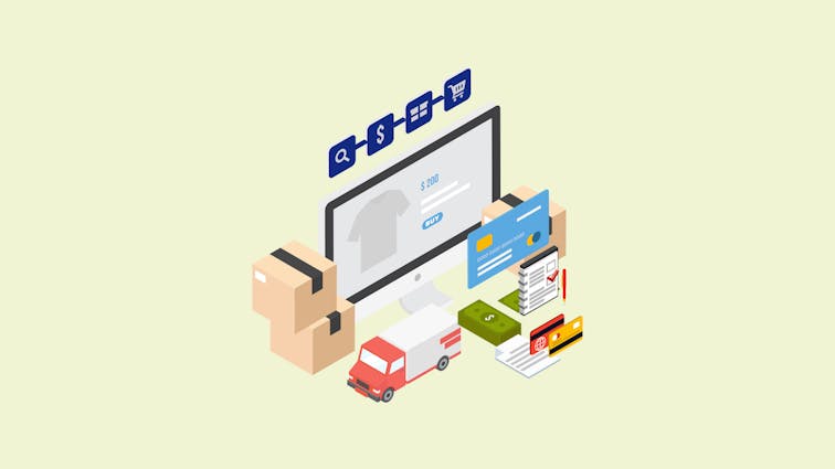
5.1: Transparent Pricing and Shipping Costs
Justifying Prices
Transparent pricing is like clear price tags in a store. Customers know what to expect. Consider:
- Clarity: Are you clear about the total cost, including taxes and fees?
- Value: Are you explaining why your prices are set at their current levels?
Free Shipping and Other Incentives
Offering free shipping or other incentives is like a special sale in a physical store. Consider:
- Attractiveness: Are your shipping offers attractive to customers?
- Visibility: Are you promoting these offers where customers can easily see them?
5.2: Clear Return Policy
Building Trust
A clear return policy builds trust like a store’s satisfaction guarantee. Consider:
- Clarity: Are your return policies easy to find and understand?
- Fairness: Are your policies fair and customer-friendly?
Easy Return Process
Making returns easy is like having a hassle-free return counter in a store. Consider:
- Simplicity: Is your return process simple and straightforward?
- Support: Are you providing support to customers who need to make a return?
6. Measuring Success and Continuous Improvement

6.1: Auditing Product Pages for Technical Issues
Tools and Techniques
Auditing product pages for technical issues is like regularly checking the machinery in a factory. It ensures everything runs smoothly. Consider:
- Tools: Are you using tools like Google Search Console or Screaming Frog to identify issues?
- Regular Checks: Are you conducting regular audits to catch problems early?
Common Problems to Watch For
Common problems can slow down or even halt production. Consider:
- Broken Links: Are you checking for and fixing broken links that can frustrate customers?
- Slow Loading Times: Are you monitoring page speed and optimizing as needed?
- Mobile Usability: Are you ensuring that your pages are user-friendly across all devices?
6.2: Testing and Experimentation
A/B Testing
A/B testing is like trying out different window displays to see which one attracts more customers. Consider:
- Variations: Are you testing different versions of your product pages to see what works best?
- Metrics: Are you tracking the right metrics to measure success?
Continuous Improvement Mindset
Adopting a continuous improvement mindset is like always looking for ways to make your store better. Consider:
- Feedback: Are you listening to customer feedback and making improvements?
- Innovation: Are you staying up-to-date with industry trends and implementing new ideas?
Conclusion
Product page optimization is not just a one-time task; it’s an ongoing process. It’s about understanding your product, your customer, and the journey between the two.
It’s about creating a space that’s not just functional but also engaging, persuasive, and reflective of your brand.
Remember, your product page is like a virtual salesperson. It needs to be knowledgeable, approachable, and effective. It needs to turn browsers into buyers.
So why wait? Start optimizing today, and watch your conversions grow. Your customers will thank you, and so will your bottom line. Ready to optimize?
Additional Resources (Optional)
- Google Search Console - For auditing and monitoring your site’s performance.
- Screaming Frog SEO Spider - A powerful tool for technical SEO audits.
- Optimizely - For A/B testing and experimentation.
- Moz’s Beginner’s Guide to SEO - A comprehensive guide to getting started with SEO.
I hope this article provides a comprehensive and engaging overview of product page optimization.
It’s designed to guide readers through the process, from understanding the basics to implementing advanced strategies, and encourages them to take action for increased conversions and customer satisfaction.
Let us know if there are any adjustments you’d like us to make or if there’s anything else we can assist you with!
FAQ:
1: How do I optimize my product page?
Optimizing a product page involves several key steps, including creating unique and engaging titles and meta descriptions, using high-quality visuals, providing detailed product information, implementing strong call-to-action (CTA) buttons, and ensuring mobile optimization. Regularly auditing for technical issues and adopting a continuous improvement mindset can further enhance the effectiveness of your product page.
2: What is e-commerce optimization?
E-commerce optimization refers to the process of enhancing an online store’s user experience, functionality, and performance to increase conversions and sales. It encompasses various aspects such as site navigation, product page layout, checkout process, SEO, and mobile responsiveness. The goal is to create a seamless shopping experience that encourages customers to complete a purchase.
3: What is product page SEO?
Product page SEO involves optimizing individual product pages on an e-commerce website to rank higher in search engine results. This includes using relevant keywords in titles, meta descriptions, and content, implementing structured data, avoiding duplicate content, and building internal and external links. Proper product page SEO helps attract targeted traffic and increases the likelihood of conversions.
4: How does SEO work for e-commerce products?
SEO for e-commerce products works by enhancing the visibility of product pages in search engine results. It involves keyword research to understand what potential customers are searching for, optimizing on-page elements like titles and descriptions, using structured data for rich snippets, ensuring mobile-friendliness, and building quality backlinks. By aligning with search engine algorithms, SEO helps e-commerce products reach a wider audience and drive more sales.
5: What makes a great e-commerce product page?
A great e-commerce product page effectively showcases the product and compels visitors to make a purchase. Key elements include clear and engaging product titles and descriptions, high-quality images and videos, transparent pricing and shipping information, easily accessible customer reviews and testimonials, strong CTAs, and a user-friendly design that works across devices. A well-optimized product page builds trust and provides all the information a customer needs to make an informed buying decision.


